follow the red shoe...

Follow the Red Shoe
The story of the red shoes is told here, I was a guest blogger over on Glyn Dewis' blog and talked about the shot there and the red shoes made an appearance in a Jimmy Choo competition and came runner up. So you could say the shoes were following me around. At this point I must say, they belong to Catherine, my wife. Just to put the record straight, hmmh. But everyone commented on the shots and liked them, so I guess you could say I am now following the red shoes. They have become my signature shot, sort of. You don't want to go limiting yourself, too much. But at this point I realised I needed to pen an identity for what I do.

First an foremost I am a portrait photographer. That's what I do; I love taking photographs of people. Any brand image or logo I devised would have to take that into account. I try to give my portraits an edge, make them different - don't we all. So any branding must mirror this as well. I did a lot of thinking, sketching ideas, scribbles in many notebooks (I like my notebooks - and spend too much money on them, but don't tell Catherine...) and I realised that the picture that summed up what I wanted to say was the red shoe shot.
So that became my logo. If you are a portrait photographer, a landscape photographer or whatever type of photographer you are, your logo doesn't have to be a person, a mountain, a shutter... it can be, and if that's what you choose, okay. But so many others have chosen the same before you and guess what? so many others will choose the same after you. So be bold, go for something different. I went for the red shoes. These ones are extreme, dynamic, vibrant (that's red for you). They make you look. They make you stare. They are supposed to, especially when worn by a lady, quite.

And they make you think. Logos are meant to stand out. they are meant to shout 'hey look at me!' And if you think for a moment, you will think of loads of logos that at first glance bear no resemblance to the product... or do they?
One of my favourites is the Hairy Baby, they do the most amazing tee shirts in Ireland; all with a joke attached to them; you'll get it if your Irish, otherwise... that's all I'll say... Have a look at their web site http://www.hairybaby.com/, great fun. What does Hairy baby have to do with tee shirts? Nothing, but their marketing and their product is so good, say 'hairy baby' to an Irishman and they'll probably start laughing.
One of my favourites is the Hairy Baby, they do the most amazing tee shirts in Ireland; all with a joke attached to them; you'll get it if your Irish, otherwise... that's all I'll say... Have a look at their web site http://www.hairybaby.com/, great fun. What does Hairy baby have to do with tee shirts? Nothing, but their marketing and their product is so good, say 'hairy baby' to an Irishman and they'll probably start laughing.
So the shoes have became my logo which sort of morphed into a signature. But I hope that they become much more than that. I hope they engage peoples emotion; they are sexy and a bit mysterious and have an edge. I want people to think that when they think of my photography. So the photography is anchored to the logo.
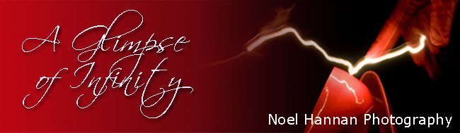
In this image I am trying to create, I want to present a united face to the world. So red and black will feature on my website, my blog and any promotional material I might use. And it will be red fading to black, because that's the way I wanted it and it is striking; there is a uniformity about it. Its my signature.

My Website

My Blog
I also have a great interest in Architecture and Ireland and have another blog; Infinite Ireland. Completely different subject, different country, but the blog header is easily recognizable; green fading to black and the font is the same. The message is the same; this is Noel Hannan's photography (yeah, I know my name is on the header...)

Infinite Ireland
But I wanted to link them in another way, so the word 'infinite' was thrown into the mix and there you have it. that's me, and my photographs.
The design of a logo / branding / image is all important because it is a chance for the photographer to stand out from the crowd. It should be distinct, but easily recognizable. A logo should be dynamic, unique and memorable. You want to make sure a client remembers your logo.

Keep following the Red Shoe...
This is the part of the branding that you can control. What the public perceives, that's the other part. The part that you have to somehow influence.

Keep following...
Keep watching for part two..

Noel, So true! I agree whole heartily with what the brand says. Its sassy and hot and it stands out in a crowd. I would certainly pick up this card and keep it. PS, red is my favorite color so I was sold before the lighting hit the shoe! Looking forward to part 2.
ReplyDeleteWarm regards, Kelley
Hi Kelley, glad you like it! That was the effect I was after, and would be a great goal for your life; to alweays stand out in a crowd.
ReplyDeleteThanks for commenting kelley.
ps, I'n still writing part two...
Noel
Noel.
ReplyDeleteQuite rightly as you say 'branding' is so important as it has to reflect your own unique style of photography otherwise it just wont work.
Every aspect of your branding is equally as important...colours, fonts used, logo style the whole package. You my friend I think have 'nailed it'!
Rightly or wrongly, if I see red shoes I think of Noel Hannan Photography...lol :)
Seriously though, I do and that says your branding is working...you have an identity andI guess this all ties in with what we've talked about alot lately...the subject of having a unique style.
Well done to you mate; the time you've spent 'head scratching' has been well worth it.
Best wishes,
Glyn
Hi Noel.
ReplyDeleteI love the look of your business cards and the logo's you've chosen for the blogs. Marketing is, in part, about trying to get people to remember the message your communicating and psychologically people will remember more striking things, which is certainly what you've got here. The choice of colour (red) also re-enforces the image in peoples memories, being such a strong, bold colour contrasting so well with the black.
Regards,
David
Glyn, David, thanks for dropping by. A lot of head scratching and I'm getting there... the next thing is getting them out to the wider world. Thats when the fun starts!
ReplyDeleteThanks for commenting guys,
all the best
Noel